General settings
Here you can find the general settings of a menu.
General Settings > General Settings
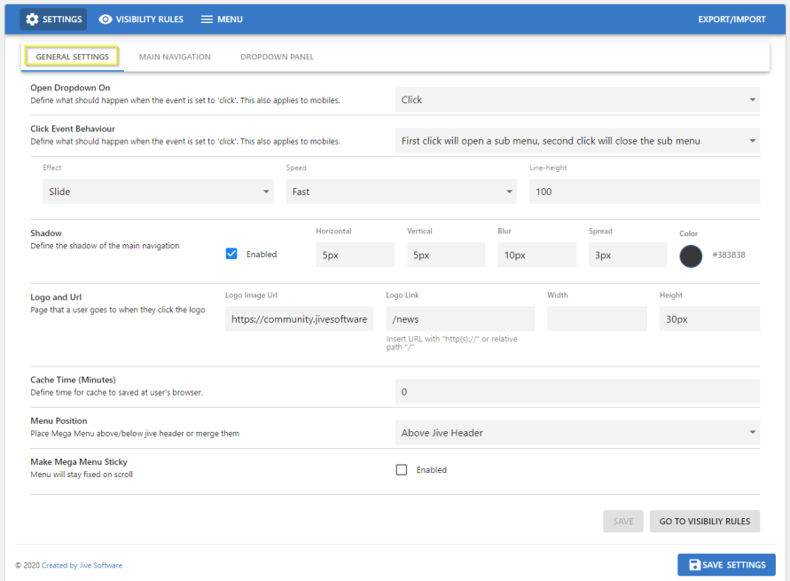
- Open Dropdown on:
- Hover
- Click
- Effect for panel / dropdown
- None
- Fade
- Slide
- Push - site content is pushed down
- Speed of panel rendering: Fast / Medium / Slow
- Line Height: Defines the height of the hover background
- Shadow: Customize the shadow effect on dropdown items
- Logo: Link to Logo image file
- URL: Target link when click on logo
- Cache Time: Time before Menu structure is updated
- Greater values can improve performance
- Menu Position:
- Show Menu above standard Jive header bar
- Show Menu below standard Jive header bar
- Merge Menu with standard Jive header bar
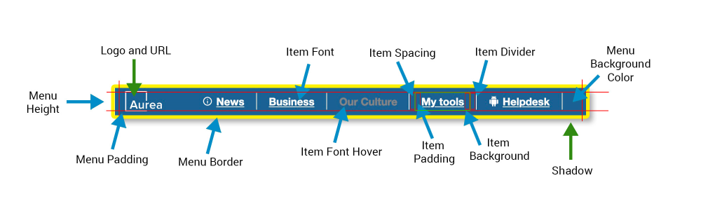
General Settings > General Settings: Main Navigation : Main Menu - general
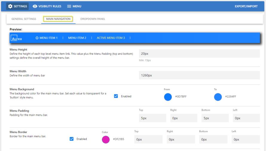
Main Navigation (Top Level)
- Preview
- Menu Height
- Menu Width (set 40 px less than Global Theme width configured)
- Menu Background Color
- Menu Padding
- Menu Border
General Settings > General Settings: Main Navigation : Top Level Menu Items
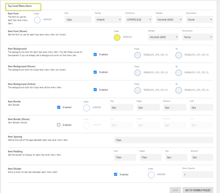
Top Level Menu Items
- Font: Family - Supports various font families, Size, Color, Text Transform, Weight, Decoration, Alignment
- Font hover: Color, Weight, Decoration
- Background Color, can be single color or a gradient from/to shade: on Menu hover and when active
- Item Spacing
- Item Padding (left, right)
- item Divider: Enabled/Disabled, Color and Opacity
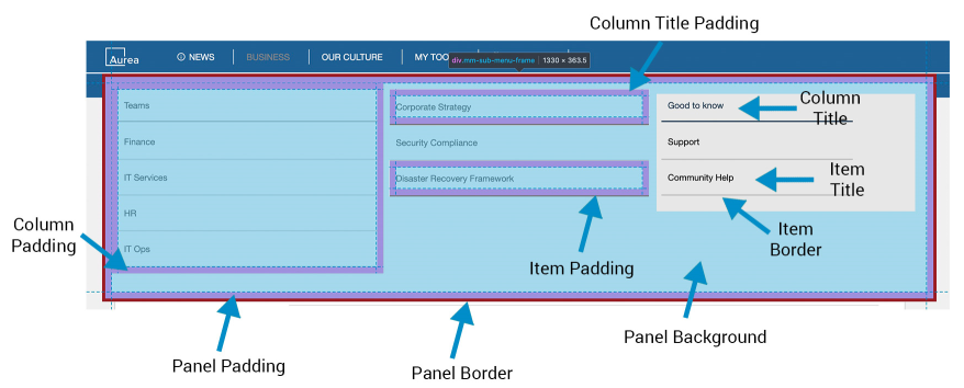
General Settings > General Settings: Dropdown Panel: Panel Settings
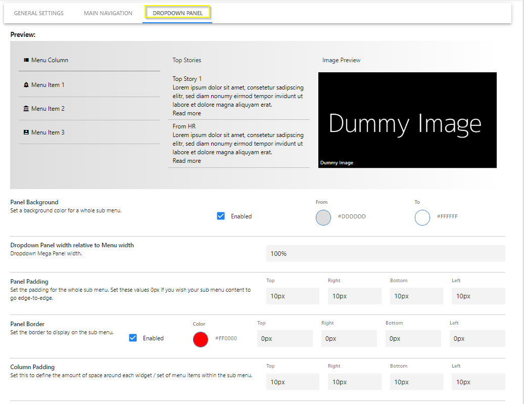
Dropdown Panel
- Preview
- Panel background
- Panel width in percent
- Panel padding
- Panel border: Color and size
- Column Padding
General Settings > General Settings: Dropdown Panel: Grid (Column)
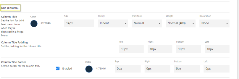
Grid (column)
- Title: Family, Size, Color, Transform (Normal/Capitalize Words/UPPER CASE/lower case), Weight (Light/Bold/Normal), Decoration(None/Underline), Align (Center/Left/Right)
- Font: family, size, color, transform, weight, decoration, alignment
- Padding
- Border
General Settings > General Settings: Dropdown Panel: Sub-level 1
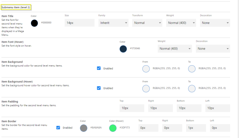
Sub-menu item (Level 2)
- Item Title: Family, Size, Color, Transform (Normal/Capitalize Words/UPPER CASE/lower case), Weight (Light/Bold/Normal), Decoration(None/Underline), Align (Center/Left/Right)
- Item Font (hover): color, weight, decoration
- Item Background
- Item Background (hover)
- Item Padding (top, right, bottom, left)
- item Border
General Settings > General Settings: Dropdown Panel: Third Level Menu Items
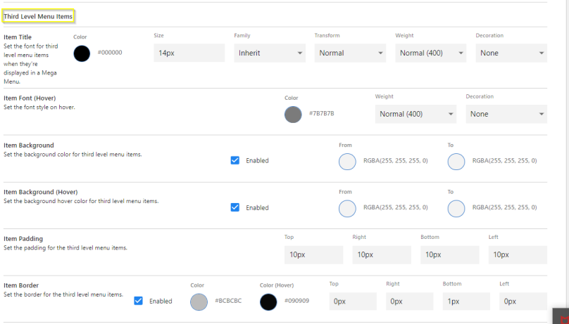
Third Level Menu item
- Item Title: Family, Size, Color, Transform (Normal/Capitalize Words/UPPER CASE/lower case), Weight (Light/Bold/Normal), Decoration(None/Underline), Align (Center/Left/Right)
- Item Font (hover): color, weight, decoration
- Item Background
- Item Background (hover)
- Item Padding (top, right, bottom, left)
- Item Border
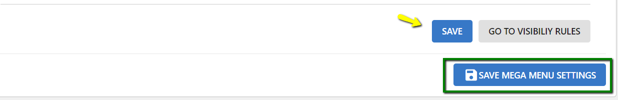
Save configuration on page.
Confirm all settings with Save Advanced Navigation Settings.
Menu Settings > Create new menu item

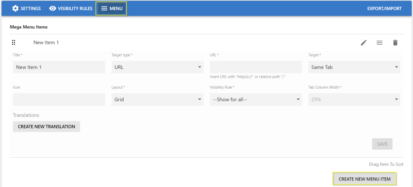
Main Menu Item:
- Item Title
- Item Target/URL Type:
- None
- Content Picker: Search and select Jive content
- Place Picker: Search and select a Jive place
- URL > Set Target URL
- Target > Set Target
- Item Icon - Select Icon from Library
- Item Layout:
- None
- Grid: Menu - Sub Menus are displayed in a multi-column/row Layout
- Vertical Tab - Sub Menus are displayed in a single Column
- Tab Column Width
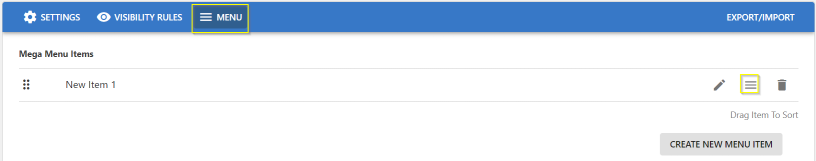
Menu Settings > Manage Menu Items
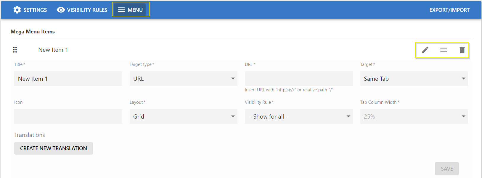
Use the manage icons:
- To edit (pencil icon).
- To add/access sub-menu items (three-lines icon).
- To delete (trash can icon).
- To re-arrange the item: drag and drop within the list.
Menu Settings > Main Menu > Translation for various languages
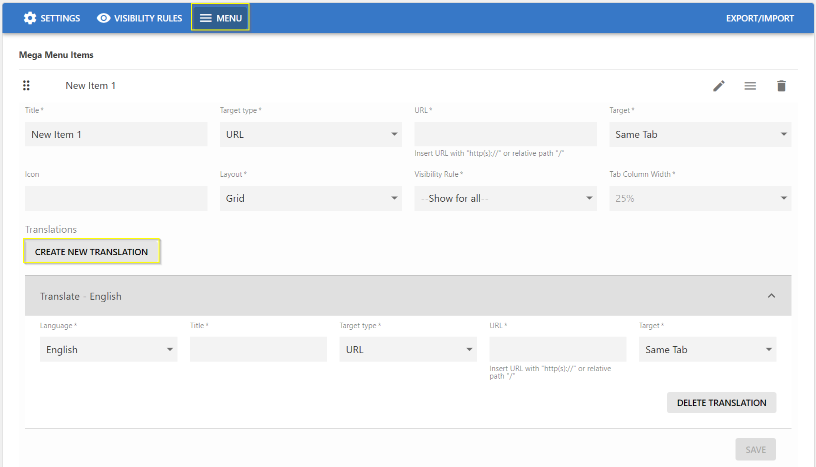
Menus can be configured in various languages:
- Click Create New Translation.
- Select the Language in which the Main Menu is to be displayed.
- Provide the Title in the respective Language.
- Item Target/URL Type:
- None
- Content Picker - provide the content in the respective language.
- Place Picker - provide the Place, the user is to be navigated to.
- URL - Specify the dedicated target URL link (internal/external).
Menu Settings > Creating Dropdown Menus
To create/access dropdown menus:
- Click the burger/three-lines icon.
- Click the pencil icon to add/edit details.
- Sub-Menu Title, Icon, Visibility Rule
- Click Save.
Menu Settings > Creating menus for the Dropdown menus - Vertical Tab Style
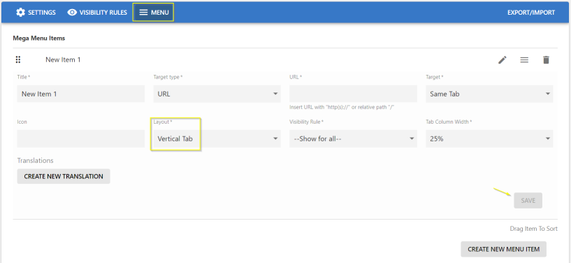
To create the Dropdown menus in Vertical layout:
- Select the Layout as Vertical Tab and set the % for Tab Column Width.
- Specify the other details: Title, URL Type (Content Picker/Place Picker/URL), URL (Place/Content/URL, Icon, Visibility Rules as appropriate).
- Click Save to save the Settings.
- To add more Dropdown menus, click Add Column / Add Row.
- To delete a Dropdown menu, click the appropriate trashcan icon.
- Click Save.
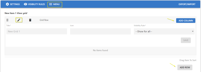
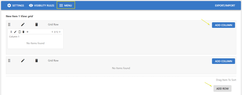
Menu Settings > Creating menus for the Dropdown menus - Grid Style
To create the Dropdown menus as a Grid:
-
Select the Layout as Grid
Note: Tab Column Width is disabled.
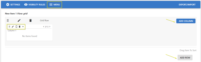
-
In the screen, use the edit set of icons highlighted to:
- Pencil icon: edit the column and provide the sub-menu details: Title, URL Type (Content Picker/Place Picker/URL), URL (Place/Content/URL, Icon, Visibility Rules as appropriate)
- Mobile icon: Show/Hide menu in mobile
- Trashcan icon: Delete column
-
-
icon: add another sub-menu/element.
This opens the Create Item screen.
-
-
Adjust the column width in the grid display by increasing/decreasing the parameter "< 4/12 >" or you can work with the numbers to decide the columns to be displayed as large/narrow column.
-
Click Add Column / Add Row to add more columns in the same row or to create a new row in the Grid layout.
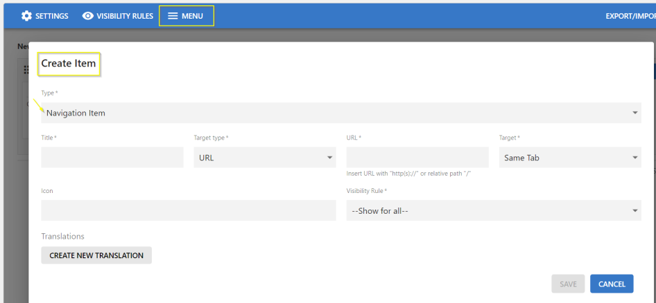
On the Create Item screen:
- Select Type:
- Navigation Item: Directs the user based on the Content, Place, or URL configured.
- Image: Use this feature to illustrate images.
- Text: Can be used to add Text to an Image or to display a Preview text.
- Accordingly provide the other details on the screen: URL Type (Content Picker/Place Picker/URL), URL (Place/Content/URL, Icon, Visibility Rules as appropriate).
- To create the sub-menu in various languages, click Create New Translation and provide the specific details.
- Click Save to save the Settings.
- Click Save Menu Settings to save all the configured settings.
Menu Settings > Creating menus for the Dropdown menus - "None" Style
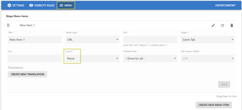
To create a Menu/Sub-menu as a Title which can be directly selected via a link:
- Select the Layout as None.
- Specify the other details: Title, URL Type (Content Picker/Place Picker/URL), URL (Place/Content/URL, Icon, Visibility Rules as appropriate).
- Click Save to save the Settings.
- Click Save Advanced Navigation Settings to save all the configured settings.